.png)
SMS Landing Page: Strategy and Best Practices
SMS is the highest open-rate channel in marketing. Across the industry, email open rates sit in a reported 15-20% range, while SMS open rates average above 90%. An SMS landing page is a dedicated, mobile-first page built specifically to receive a visitor coming from a text message and convert them within seconds. This guide is a strategic look at getting that conversion right: the design principles, the copy strategy, and the technical decisions that separate a page that performs from one that loses the click it worked to earn.
Why SMS Traffic Is Different
An SMS landing page is not a standard web page that happens to load on a phone. Three things about the visitor make it a distinct discipline.
The visitor arrives with high intent and a short attention window. Someone who taps a link in an SMS has read the message and made an active decision to engage. That intent is valuable, but the window to convert it is very short. Unlike a visitor browsing from a search result, an SMS visitor expects to land somewhere immediately relevant to the message they just read, not on a general page they have to interpret.
The visitor is on a phone, almost without exception. SMS traffic is mobile traffic. The page has to be built for a thumb, not a cursor. Anything that requires pinching, zooming, or sideways scrolling ends the conversion before it starts.
The visitor arrives with a specific expectation. The SMS that brought them set it. Any gap between what the message promised and what the page delivers creates friction, and friction at this speed means abandonment.
The Four Strategic Principles of a High-Converting SMS Landing Page
Four principles apply to any SMS campaign, and they work together rather than in isolation.
The first is message match. The headline and opening line of the page must directly reflect the offer made in the SMS. If the text said "Your exclusive 20% discount is waiting," the page should open with that discount, not a brand introduction or a generic hero image. The visitor tapped for one reason, and the page should confirm that reason in the first second.
The second is single focus. An SMS landing page has one goal and one call to action. It is not a navigation tool like a homepage or a product page. Every element should move the visitor toward that one action, and anything that does not is removed.
The third is speed above everything. A page that takes more than about three seconds to load on a mobile connection loses most of its SMS traffic before it renders. Page weight, image compression, and hosting performance are not technical afterthoughts here. They are conversion decisions, because the fastest, most persuasive copy never gets read if the page does not appear in time.
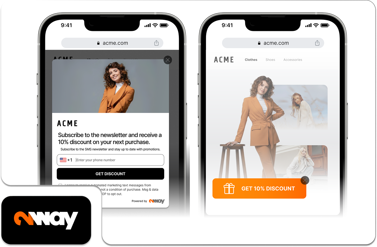
The fourth is frictionless conversion. Every field, step, and decision between the visitor and the conversion costs a share of the traffic. For an opt-in page, a single phone number field outperforms a full contact form every time.
Structuring the SMS Marketing Landing Page
The anatomy of a well-built page, from top to bottom, follows the principles above.
It opens with a headline that restates the core offer from the SMS in plain language. Directly below, one sentence of supporting copy that adds context or a real reason to act now, without introducing any new idea. Then the primary call to action, placed above the fold, so the visitor never has to scroll to find the thing they came to do.
If the page needs supporting content, for example a short explanation of what the customer is signing up for or what they will receive, it belongs below the fold as secondary information. It should never sit as a barrier between the visitor and the action.
Social proof, if it is used at all, should be minimal and specific. One short testimonial, or a single concrete number such as "Joined by 12,000 customers," adds credibility without adding clutter. A wall of logos does the opposite on a small screen.
The page should close with a clear restatement of the offer and a final call to action, for the visitor who read past the first one before deciding.
Copy Strategy for SMS Landing Pages
SMS visitors are in motion. They tapped a link on their phone while doing something else. The copy has to respect that context: direct, specific, and free of any marketing language that slows the reader down.
Headlines should state the offer, not describe it. "Get 20% off your next order" outperforms "Discover our exclusive member savings," because it tells the visitor exactly what they get without asking them to decode anything.
Body copy, where it exists at all, should answer the single question the visitor most likely has in that moment: what happens when I tap this button? Removing that uncertainty does more for conversion than any amount of brand storytelling.
Urgency, when it is genuine, should be stated plainly. A real deadline or a real limited quantity raises conversion. Vague urgency such as "limited time only" with no specifics is increasingly ignored by experienced mobile users, and using it where no real limit exists erodes trust for the next campaign.
Opt-In Pages vs Post-Click Pages
There are two primary types of SMS landing page, and they have different jobs.
An opt-in SMS landing page exists to collect phone numbers and marketing consent. It is the destination for QR code campaigns, paid social, or any campaign whose goal is growing the subscriber list. The design priority is minimizing the number of fields and maximizing the clarity of the value exchange: the visitor should see exactly what they are giving and exactly what they get for it before they are asked to act.
A post-click SMS landing page exists to convert a customer who is already subscribed and has tapped a link in a campaign message. This visitor already knows the brand and has already consented, so the priority shifts from persuasion to speed of transaction: getting them from the tap to the completed purchase, booking, or action in as few steps as possible. The same page design serves these two jobs poorly; the campaign should use the right one for its goal.
How 2way Makes SMS Landing Pages Executable
The strategy above describes what the page has to do. Execution depends on the platform, and three capabilities are worth looking for. 2way is used here as the example that meets them.
The first is the ability to launch a mobile-ready page without a separate web development resource. 2way's landing pages are built for mobile traffic and run on 2way's own infrastructure, so there is nothing to host or maintain and a campaign does not wait on an IT queue to go live. For a time-bound SMS campaign, that launch speed is itself a conversion factor.
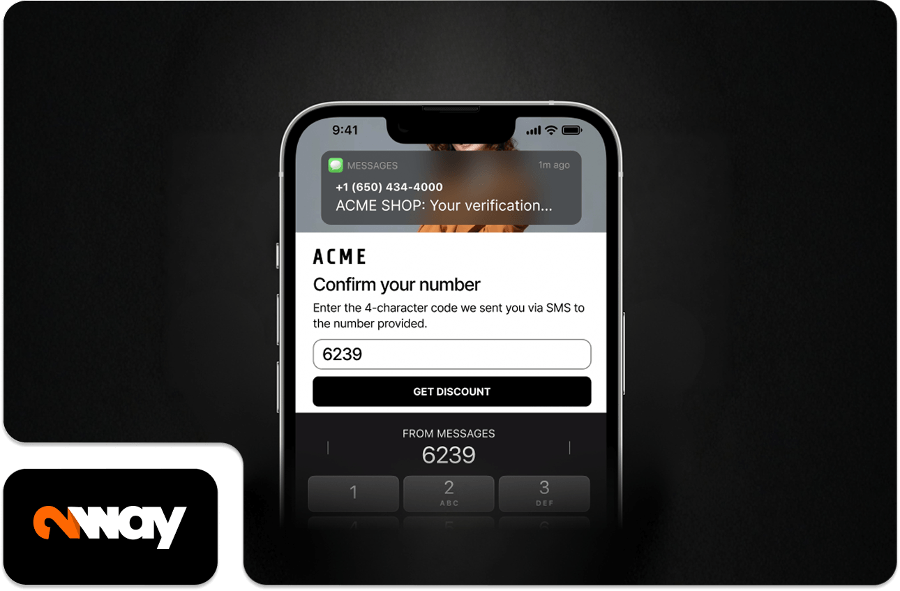
The second is direct integration between the page and the SMS platform. An opt-in captured on the page should flow automatically into the correct subscriber list with no manual data handling. With 2way, the number is added to the database after the customer confirms it by one-time password, so the contact is verified and routed without anyone exporting and re-importing a file.
The third is analytics that connect the page to the message. 2way ties send data, clicks, sign-ups, and code redemptions back to the specific campaign and contact, so page performance can be judged against the campaign that drove the traffic, not in isolation.
Conclusion
An SMS landing page is a purpose-built conversion environment for a visitor who arrived fast, with high intent and a short window of attention. The strategy that separates campaigns that convert from campaigns that waste their best traffic is consistent: message match, single focus, speed, and frictionless conversion. 2way exists to build, connect, and measure these pages without adding complexity to the campaign workflow.
FAQ
What is an SMS landing page?
An SMS landing page is a dedicated, mobile-first page built to receive a visitor coming from a text message and convert them within seconds. It differs from a standard web page in three ways: the visitor arrives with high intent and a short attention window, is almost always on a phone, and expects the page to deliver exactly what the message promised. A general page asks them to interpret what they are looking at. An SMS landing page confirms in the first second that they reached the right place.
How fast does an SMS landing page need to load?
Under three seconds on a mobile connection. A page that takes longer loses most of its SMS traffic before the copy is ever read. Page weight, image compression, and hosting performance decide whether the message that earned the click reaches the visitor at all. For a time-bound SMS campaign, load speed is part of the conversion strategy, not a technical detail.
How many form fields should an SMS landing page have?
One or two. A single phone number field outperforms a longer contact form on every test for opt-in pages. Each extra field gives the visitor a reason to stop, and an SMS visitor's window is too short to justify any of them. If more data is genuinely needed, collect it later in the relationship, not at the first conversion.
What is message match on a landing page?
Message match is the alignment between the offer made in the SMS and what the page delivers. The headline and opening line of the page must restate the offer from the text. If the SMS said "Your 20% discount is waiting," the page opens with that discount. A brand introduction, a generic hero image, or a different offer at the top all break the match, and the visitor reads the page as if they tapped the wrong link.
Similar Posts


in the database
purchased online
before
usage
AVERAGE BASKET VALUE